Site News ~ Most Recent First
-
Hans Reiche’s 1987 booklet, The Admiral Flaws, includes a diagram that closely resembles this stamp.
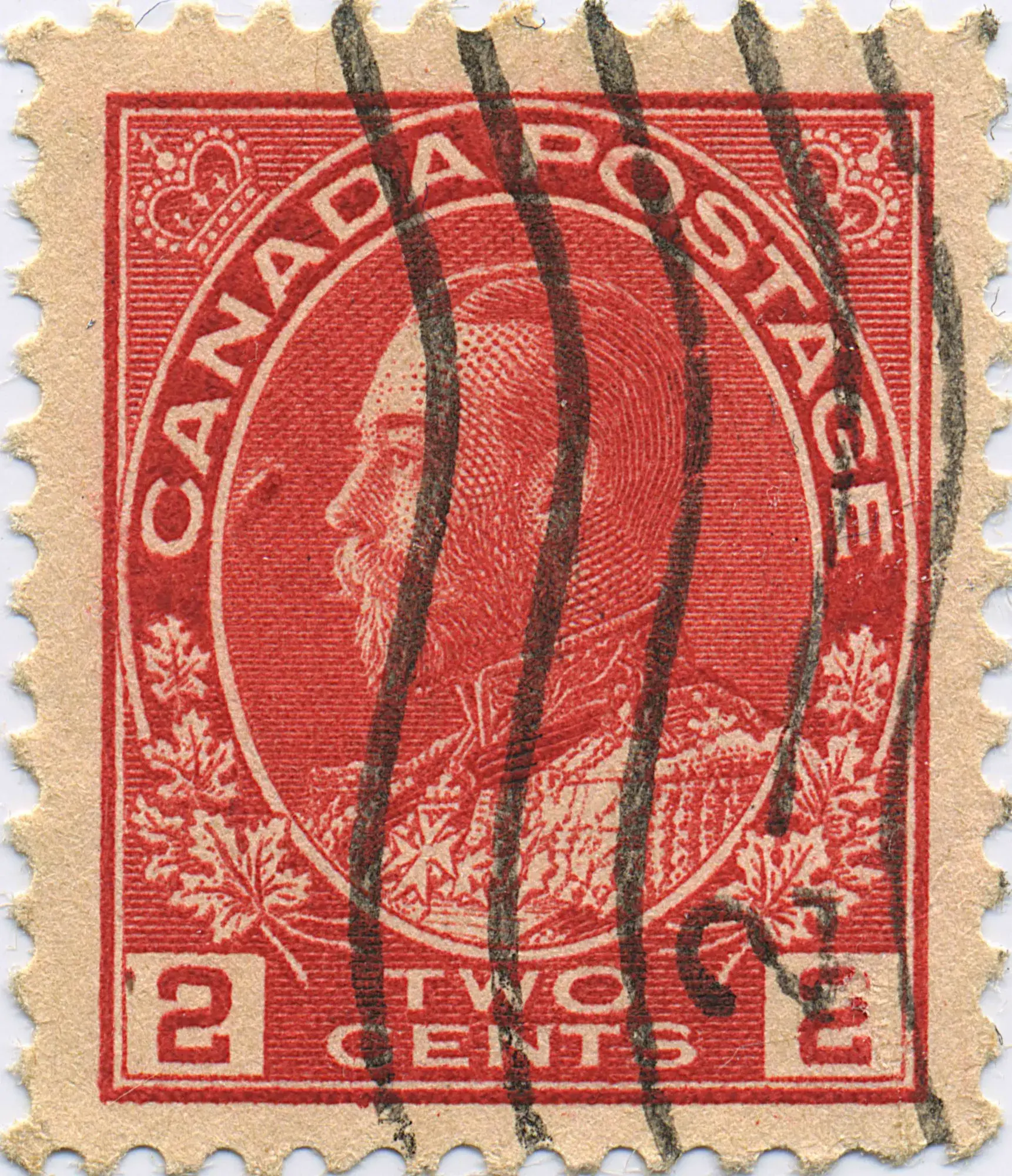
For some time, Marler and Beyond has shown a single tentative example of this flaw. Recently, however, a second confirming example has been found. This new example gives us fairly high confidence that the variety has been correctly identified as Reiche’s No. 70 on the 2¢ Carmine.
This CPV is one of the most impressive constant plate flaws reported on any value of the Admirals. A close examination reveals an especially interesting feature: the white, unprinted area lies immediately beside a strong red ink mark near the “CA” of CANADA.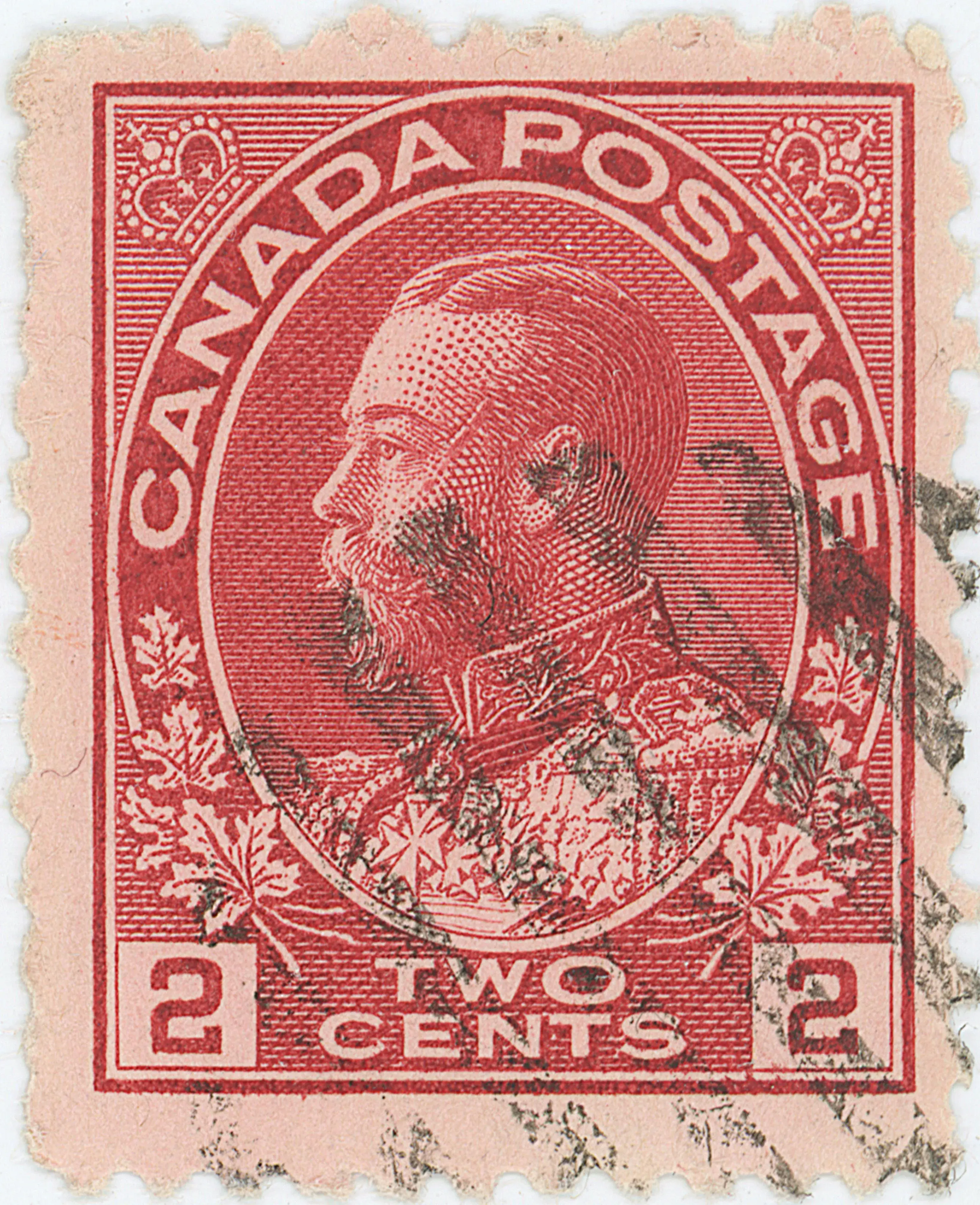
A similar effect can be seen on the 2¢ Carmine from position 10UL44, where a band of colour appears adjacent to a band of white. One reasonable explanation is localized damage to the plate, perhaps caused by a glancing blow or scraping contact with a hard object. Such an incident could have displaced the plate surface rather than simply cutting or removing metal. One part of the disturbed area may have become raised, smoothed, or otherwise unable to retain ink, producing the white paper-coloured mark. At the same time, an adjacent edge, burr, roughened area, or slight depression may have retained extra ink and printed as the strong red mark.
This kind of plate-surface displacement would explain the paired appearance seen here: a white, ink-denying area immediately beside a stronger ink-retaining area. The similarity to the flaw at 10UL44 suggests that both may have resulted from a comparable disturbance to the surface of the printing plate.

-

May added a substantial group of new Admiral variety records to MarlerandBeyond, with the strongest emphasis on the 2¢ Carmine issue. The month’s additions included retouches, re-entries, plate flaws and guide dots.
The 2¢ Carmine additions were extensive. New records included plated retouches such as 95UL86, 96UL20, 16-C-1-2, 16-C-2-5, 16-C-1-3, 16-C-2-6, and 3-L-4-2, along with additional flaws and re-entries involving the numeral boxes, oval band, margins, frame lines, and letters of CANADA and TWO CENTS. These entries show how small differences in line thickness, doubling, retouching, and guide marks can help distinguish related varieties.
The late-month 2¢ Carmine additions were especially useful. The 5UR42 re-entry records doubling at and below the left centre of the oval band, in CAN and GE, in the numerals, and in some letters of TWO CENTS. Other additions included plate flaws with marks in the margins, the numeral boxes, and the oval, as well as re-entries involving the “CA” of CANADA, the “NA” area, and the inner oval below the lettering.
May also added useful material outside the 2¢ Carmine issue. Two 20¢ Olive re-entries were added, one showing minor doubling in the bottom portrait lines and another showing minor doubling in the “C” and “E” of CENTS with thickening in parts of the bottom frame. A 3¢ Brown diagonal-lines flaw group was also added, with multiple marks around the left numeral box, left leaf area, and bottom margin.
Additional 3¢ Brown and 3¢ Carmine records broadened the month’s additions further, including re-entries and flaws involving the right “3”, the bottom frame, the right crown, and the lettering.
By WGB and Admiral Intaglio
-
April added a broad group of new Admiral variety records to MarlerandBeyond, with the largest concentration once again in the 2¢ Carmine issue. The month’s additions included plate flaws, re-entries, retouches, guide dots, pane delineation dots, and several entries that help document small but important differences in the design, margins, frames, numeral boxes, and inscriptions.
The 2¢ Carmine issue accounted for most of the new material. Several R28 entries were added early in the month, including flaws in the bottom margin, a pane delineation dot with two dots and a strong guideline in the top margin at right, retouching of both right vertical lines, and re-entries involving the right numeral box and the letters of CANADA. Later additions expanded the range further with Zone 2 and Zone 4 retouches, re-entries in the oval and lettering, and plated examples such as 7UL61, 8LL25, 104LL98, 117LR43, and 8LR94.
The 1¢ Green additions were also notable. Several new retouches were added on April 1, including examples involving the top frame junctions, the upper right vertical line, and the lower left vertical line. A 1¢ Green coil re-entry was also added, showing doubling of the right frame, marks in the bottom margin, and a horizontal line above the right “1”. Additional 1¢ Green flaws later in the month included a large mark in the left inner oval and another in the left outer oval.
The month also broadened coverage beyond the 1¢ Green and 2¢ Carmine issues. A 20¢ Olive pane delineation dot record was added, showing two guide dots and a faint guide line at the left of the bottom margin. The 3¢ Brown additions included retouches of the upper left and upper right vertical lines, as well as re-entries involving the right “3” and the top of the design. The 3¢ Carmine additions included a strong re-entry in Zone 19, with doubling of the bottom line of both numeral boxes, the bottom of the portrait oval, many leaves, and the letters “Three Cents”.
By WGB and Admiral Intaglio

-

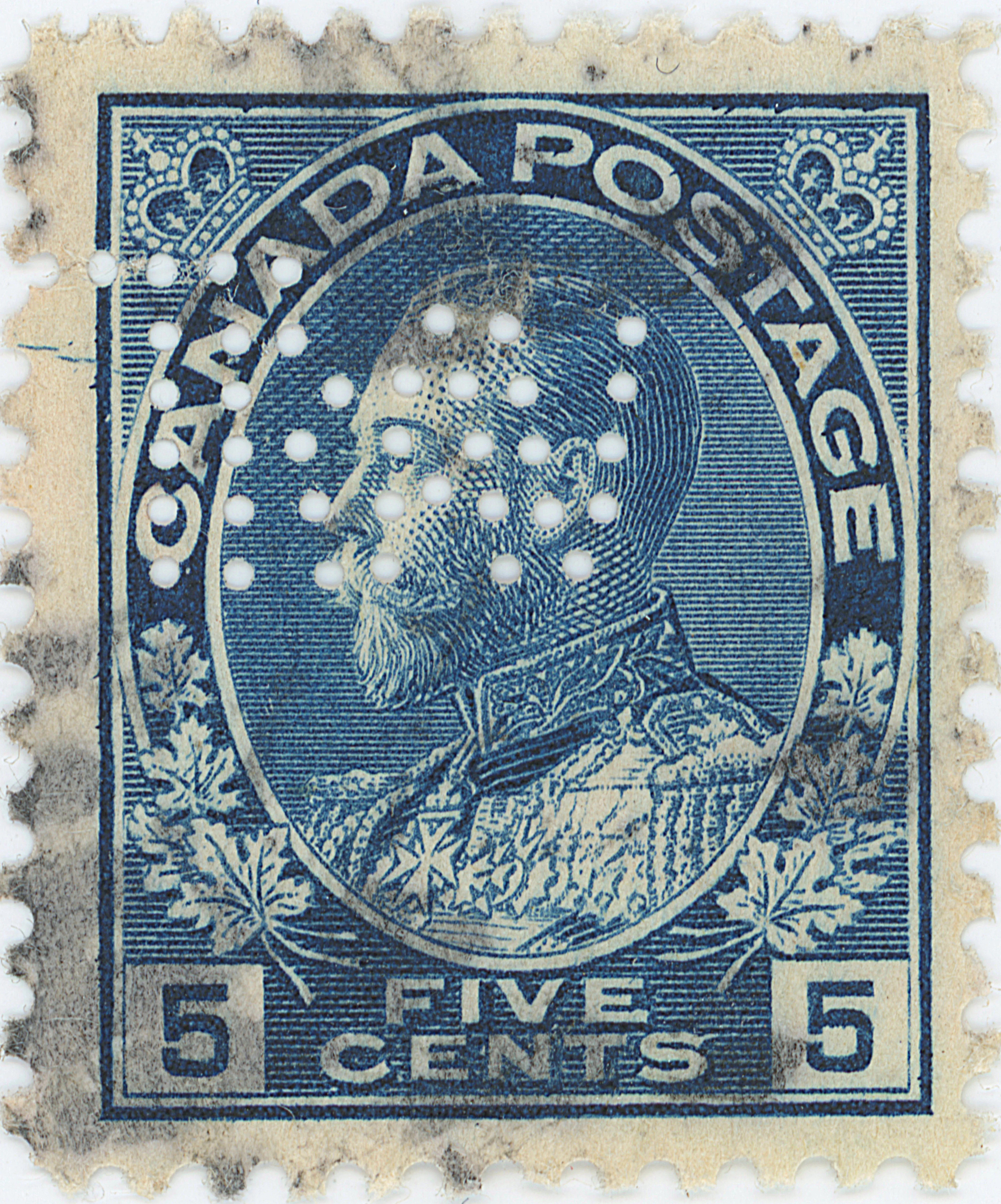
For about twenty years now, collectors have recognized the possibility that—contrary to Marler’s conclusions—some of the 5¢ Violet Admirals may have been printed from plates originally used to produce the 5¢ Blue.
The article “5¢ Violet Plate Tectonics” by Leopold Beaudet, published in The Admiral’s Log (Vol. VIII, No. 1, June 2004), first sparked my interest. For a long time, I have hoped to find examples of retouches on the 5¢ Violet matching those seen on later printings of the 5¢ Blue. Although that search has, so far, come up empty, I have not entirely given up hope.
Blue That said, some meaningful progress has been made.
A few years ago, I discovered a second example of a constant plate flaw (CPV) on the 5¢ Blue, showing two nearly parallel lines in the left margin opposite the “N” of CANADA. While that second occurrence was interesting, it was not especially unusual.
Yesterday, I located a third example of the same CPV—but this time on a 5¢ Violet rather than a 5¢ Blue.
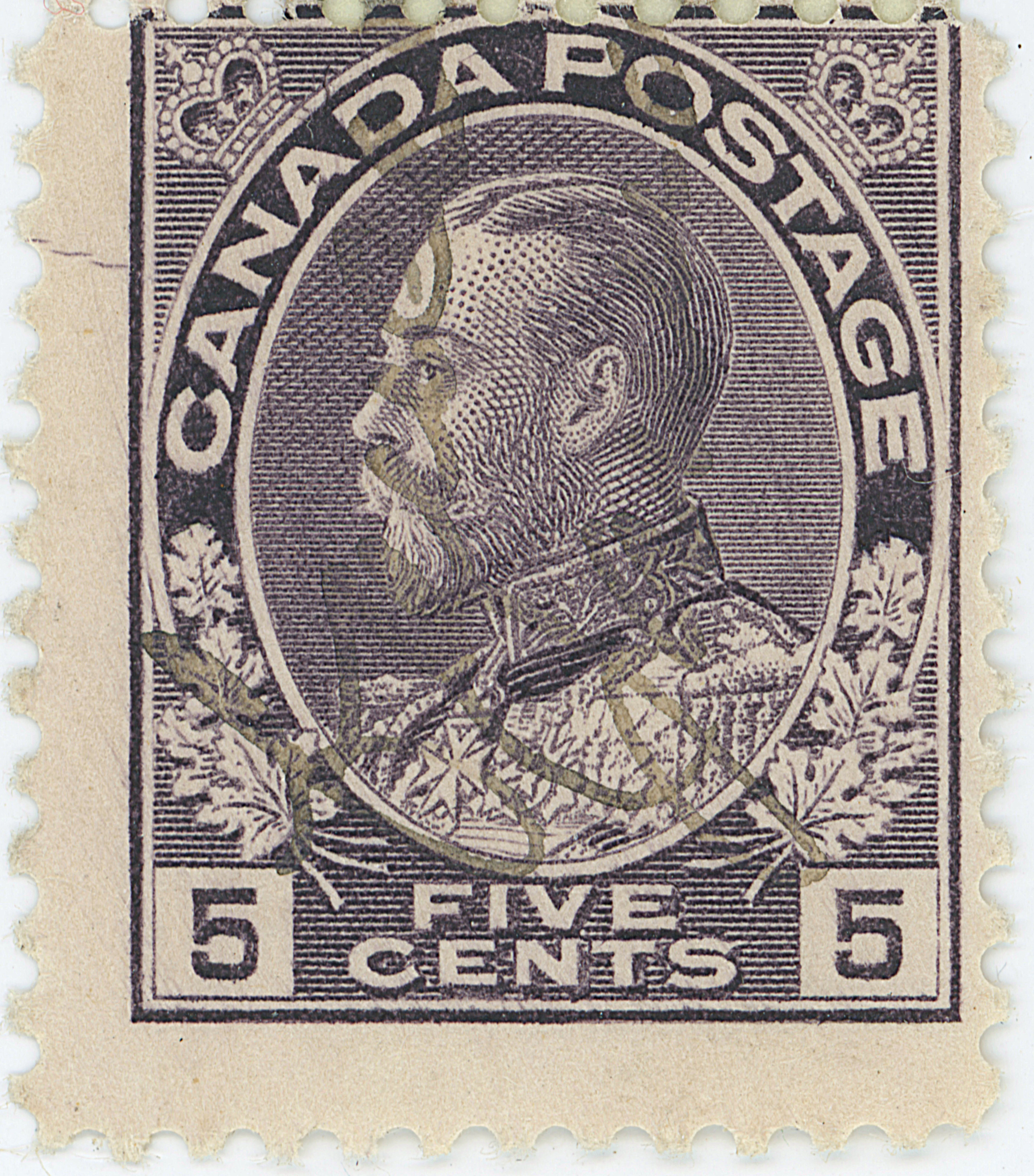
Violet The debate will no doubt continue, but this latest find provides strong, perhaps even conclusive, evidence that some 5¢ Violet stamps were indeed printed from the same plate (or plates) used for the 5¢ Blue.
-
One of my favourite aspects of the Admiral issue is the largely unexplored area of plate flaws. As mentioned elsewhere, this topic hasn’t received much dedicated study over the years.
Hans Reiche was a notable exception. Working with others, he compiled an ambitious listing of plate flaws which, in 1987, was considered quite complete. Nearly forty years later, however, we strongly suspect that many more flaws remain to be discovered.
Until recently, I had been adding pages to illustrate Reiche’s listings as examples appeared in my collection. That approach, I soon realized, didn’t make it easy for others to contribute their findings. Over the past week, I’ve reworked the site to change that.
As of late March 2026, the site now includes dedicated pages—or spaces—for each of Reiche’s 269 listed flaws. Every page contains his original diagram, though many still await matching stamp images. With more eyes scanning albums and stockbooks, we can likely fill in many of those blanks before long.
If you have a stamp that matches one of Reiche’s diagrams, or if you spot one already on the site that does, I’d love to hear from you. Your contributions will help bring this fascinating but overlooked corner of the Admiral issue to life.
